Christ’s Resurrection Church / Cino Zucchi - CZA
Christ’s Resurrection Church / Sesto S. Giovanni, Milan, Italy / Cino Zucchi - CZA
Christ’s Resurrection Church / Sesto S. Giovanni, Milan, Italy / Cino Zucchi - CZA
Christ’s Resurrection Church / Sesto S. Giovanni, Milan, Italy / Cino Zucchi - CZA
Christ’s Resurrection Church / Sesto S. Giovanni, Milan, Italy / Cino Zucchi - CZA
Christ’s Resurrection Church / Sesto S. Giovanni, Milan, Italy / Cino Zucchi - CZA
Christ’s Resurrection Church / Sesto S. Giovanni, Milan, Italy / Cino Zucchi - CZA
Christ’s Resurrection Church / Sesto S. Giovanni, Milan, Italy / Cino Zucchi - CZA
Christ’s Resurrection Church / Sesto S. Giovanni, Milan, Italy / Cino Zucchi - CZA
Christ’s Resurrection Church / Sesto S. Giovanni, Milan, Italy / Cino Zucchi - CZA
Christ’s Resurrection Church / Sesto S. Giovanni, Milan, Italy / Cino Zucchi - CZA
Christ’s Resurrection Church / Sesto S. Giovanni, Milan, Italy / Cino Zucchi - CZA
Christ’s Resurrection Church / Sesto S. Giovanni, Milan, Italy / Cino Zucchi - CZA
Christ’s Resurrection Church / Sesto S. Giovanni, Milan, Italy / Cino Zucchi - CZA
Christ’s Resurrection Church / Sesto S. Giovanni, Milan, Italy / Cino Zucchi - CZA
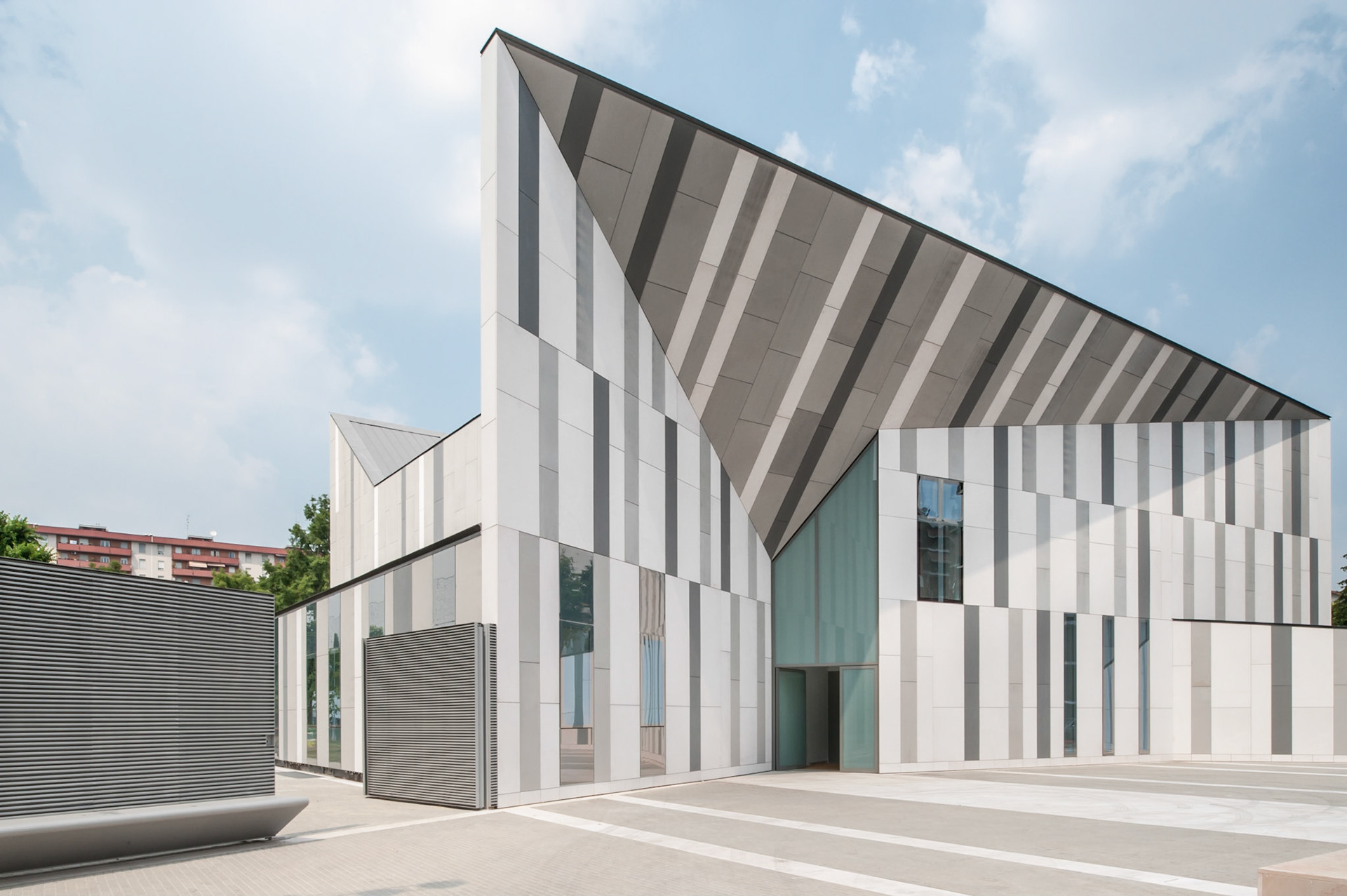
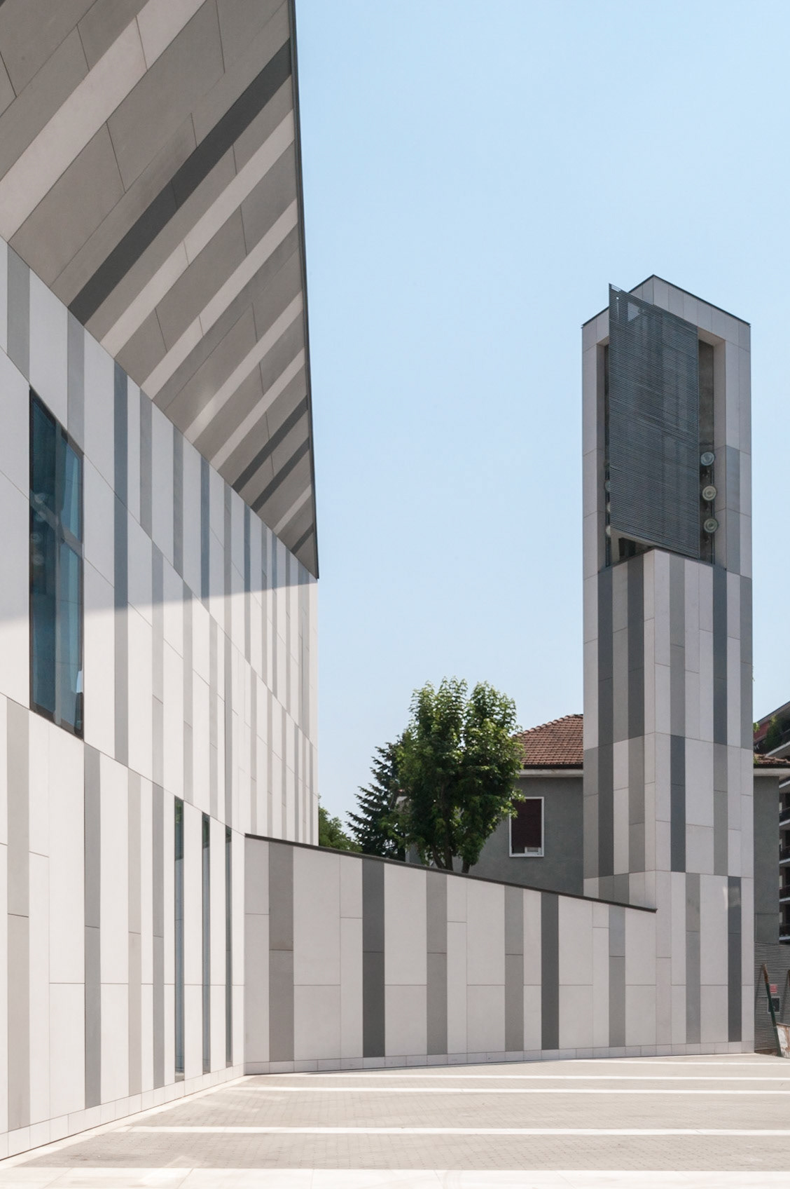
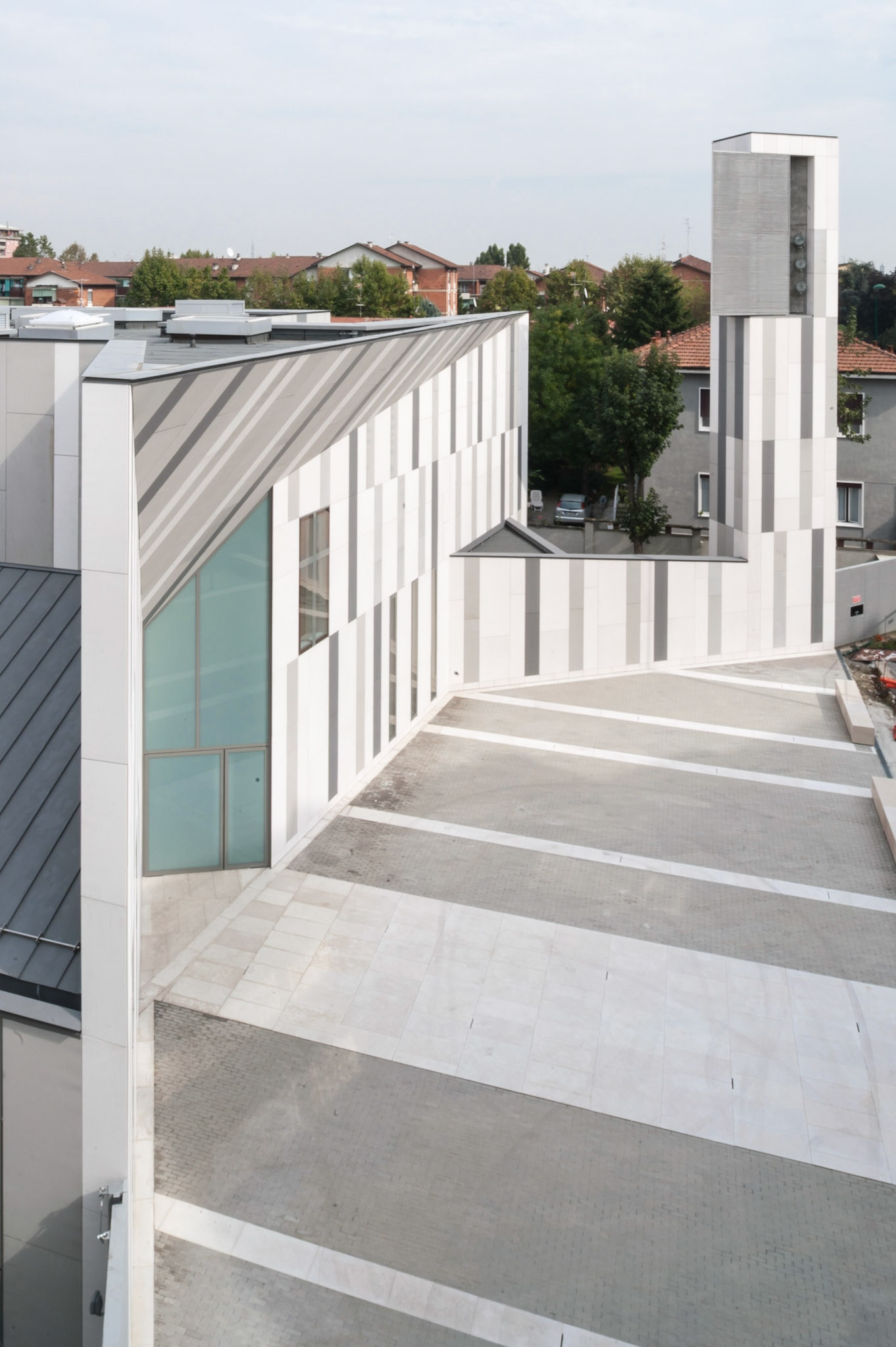
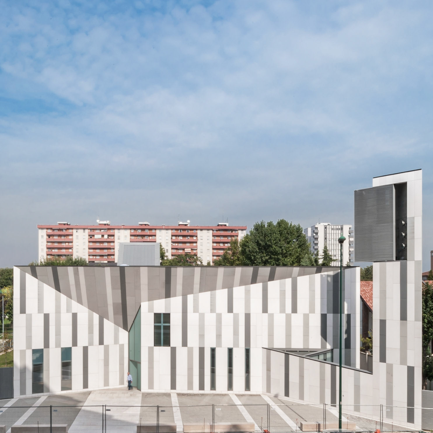
The concave profile of the façade, the bell tower sheltering the house behind, the gate-bench connecting it to the existing parish center, and the pavement of the churchyard form a collective space between the vital dimension of the road and the more intimate sacred space, recalling the active presence of liturgical buildings in Italian building fabrics.
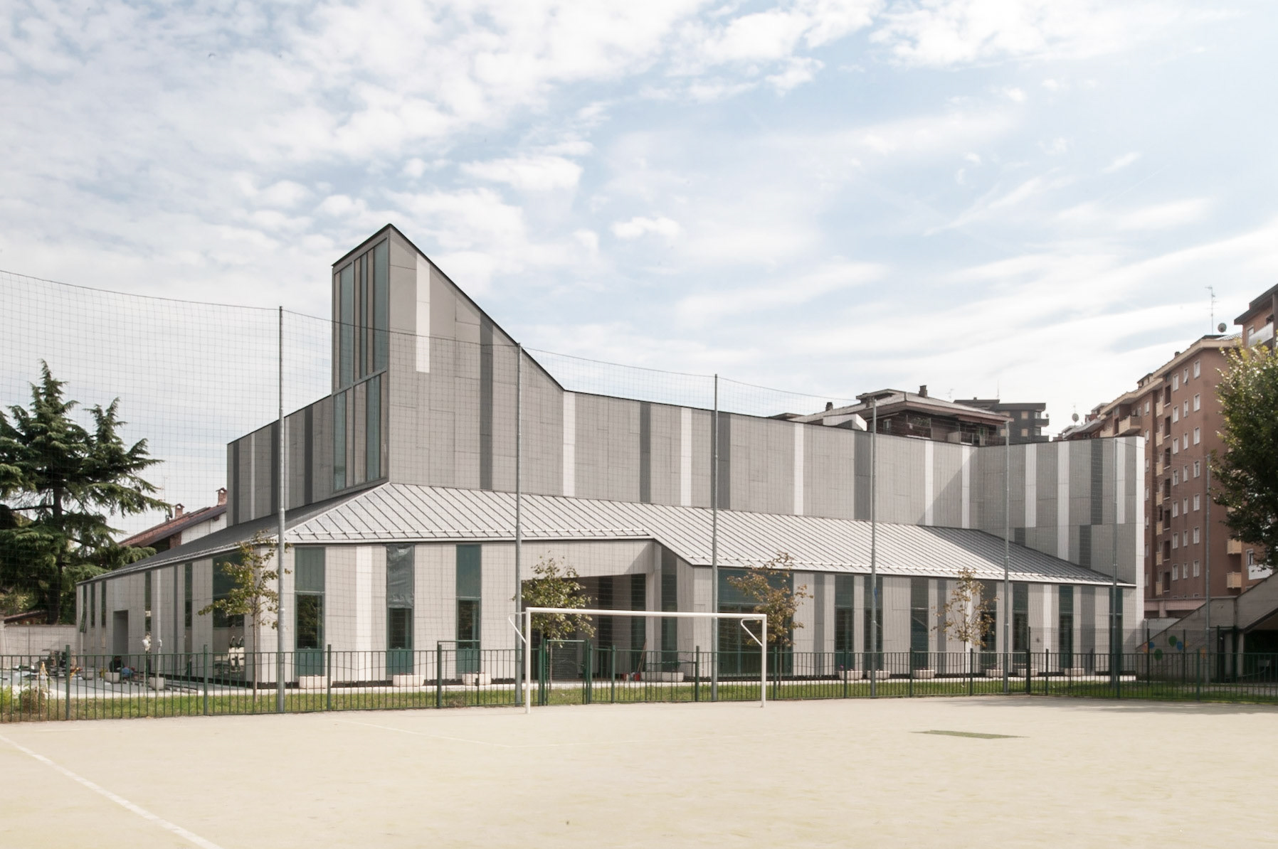
The volume of the church and of the adjacent rooms is hollowed out in such a way as to create a covered reception area for the community towards the street to the south and on the west towards the hedges that line the football field. The existing sports field around the back retains its shape and size.
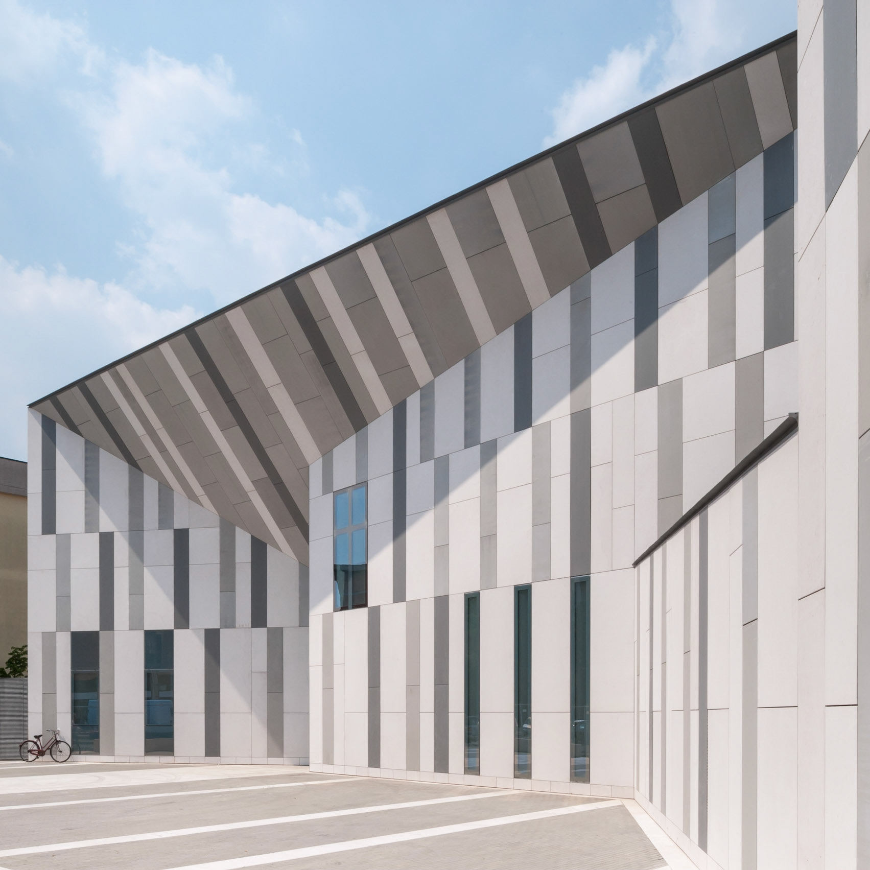
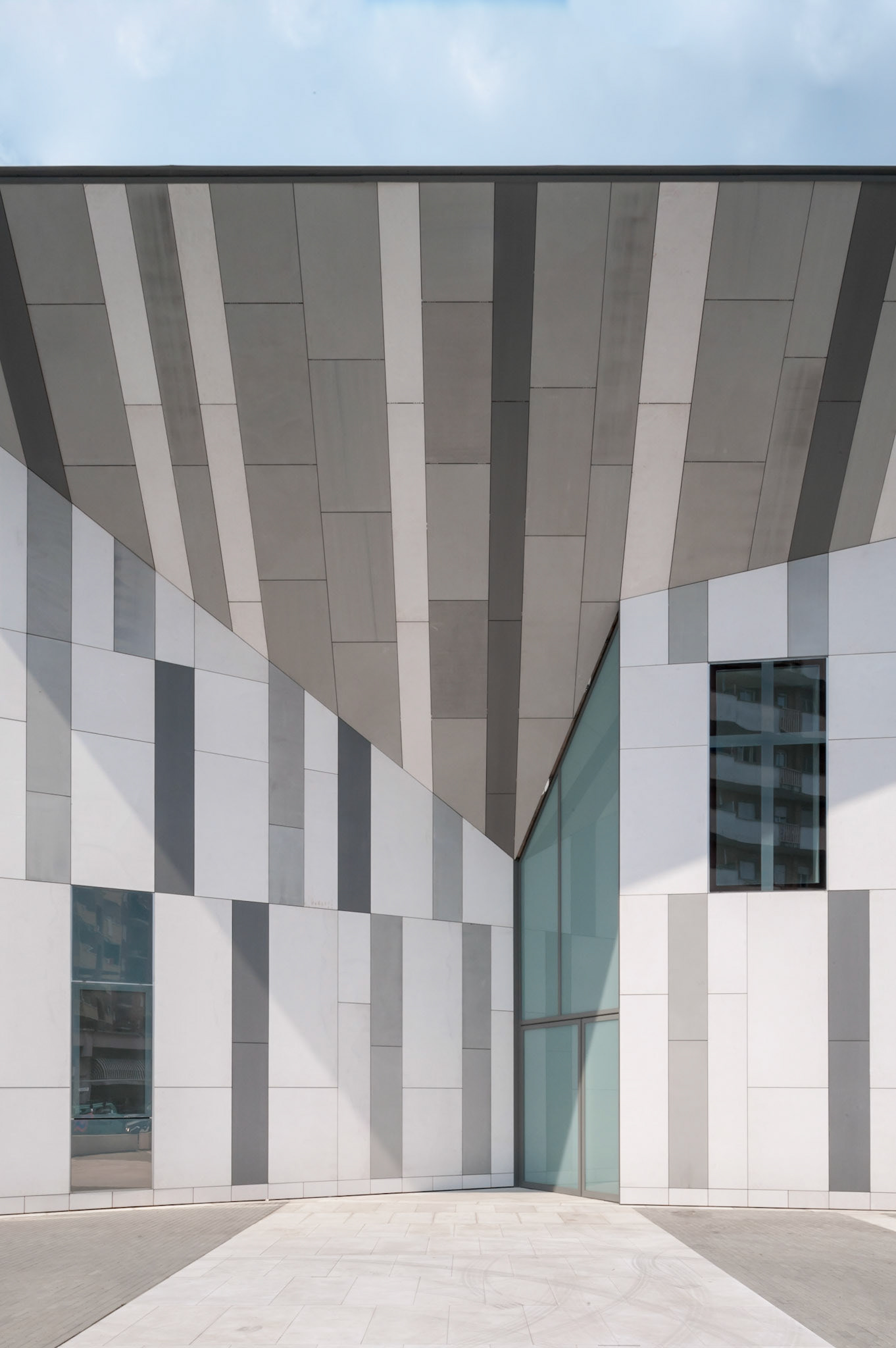
The front onto Via Pisa perfectly reflects the long tradition of “sail-style” facades, from the seventeenth century façade of Juan Caramuel’s church in Vigevano (author of the renowned “Arquitectura civil recta y obliqua”) to Gio Ponti’s church in Via Paolo Giovio in Milan. The new front takes the thread of the eaves of the nearby oratory; the concave angle between the two sides creates a sheltered area above the entrance and gives shape to the new churchyard space.
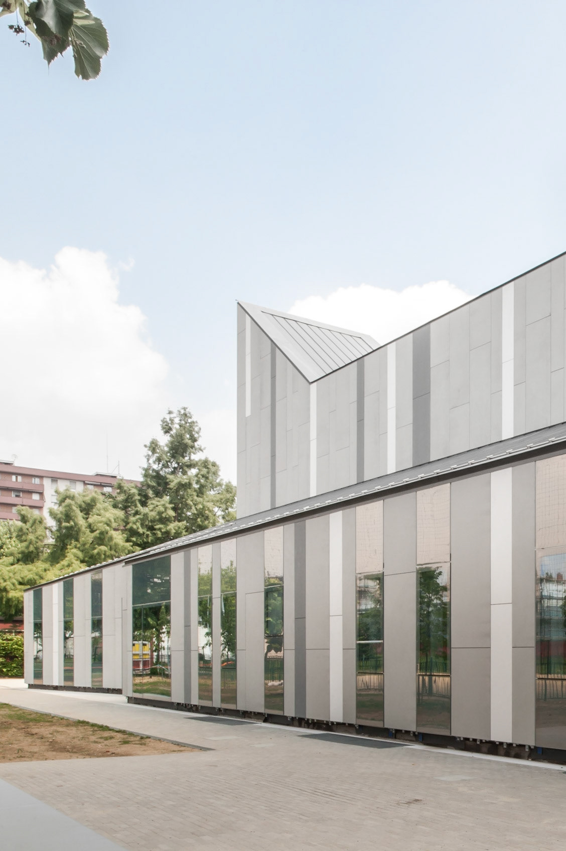
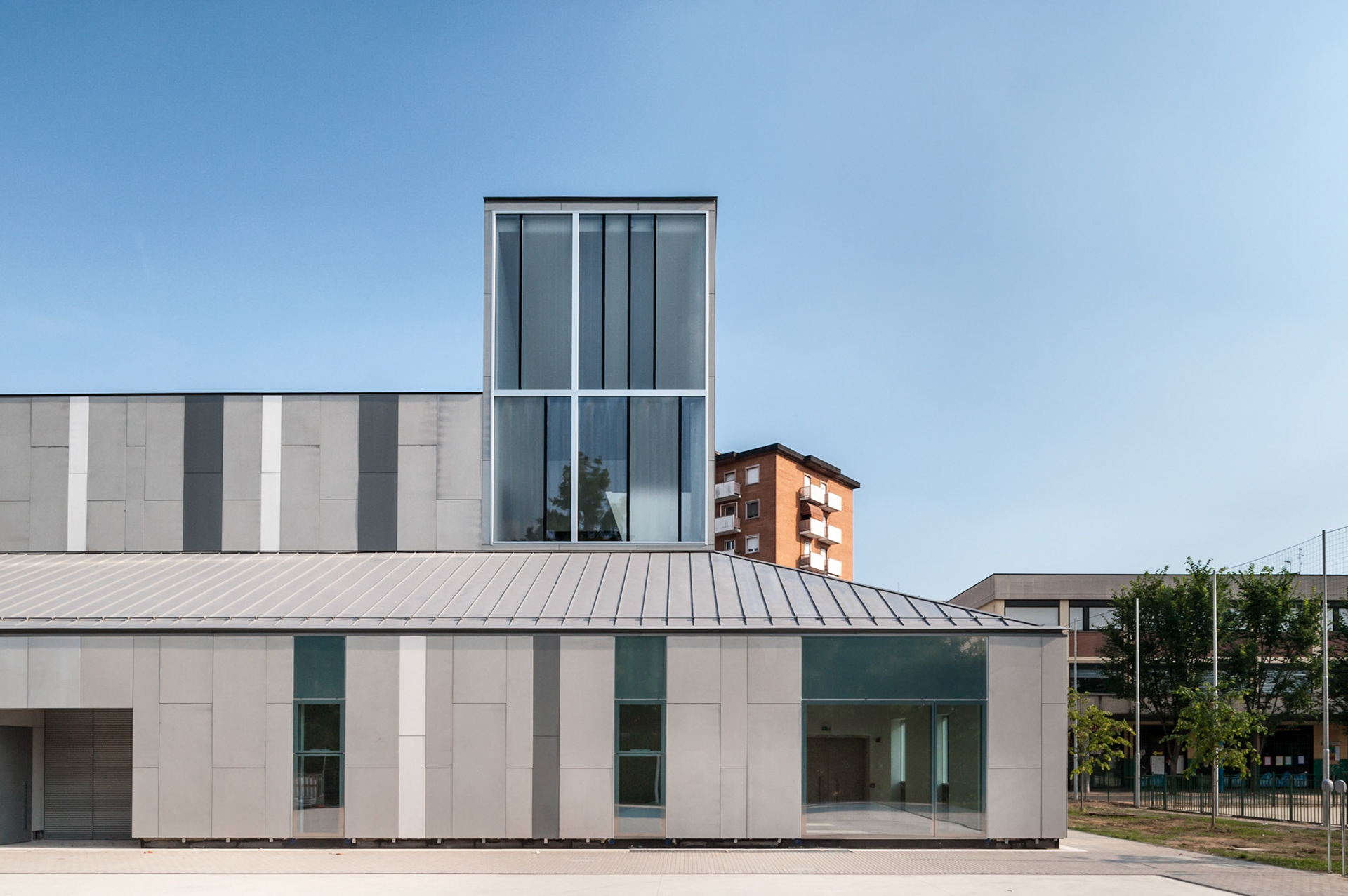
Surrounding the main volume of the church-hall a lower body covered with a pitched roof houses the spaces destined to the social life of the parish complex: priest’s offices, meeting rooms, the sacristy and the atrium to a large underground event room in correspondence to the liturgical hall.
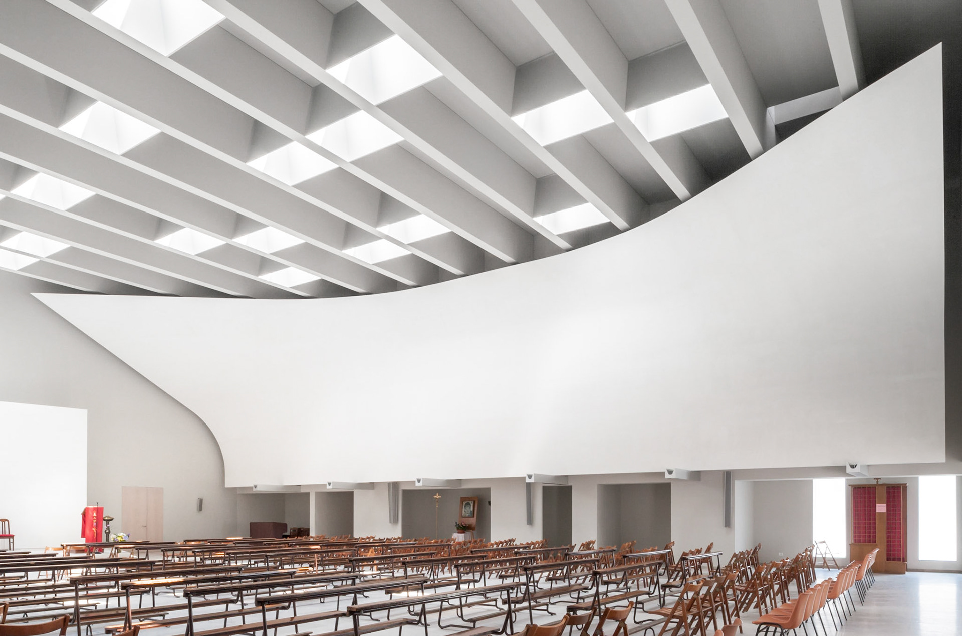
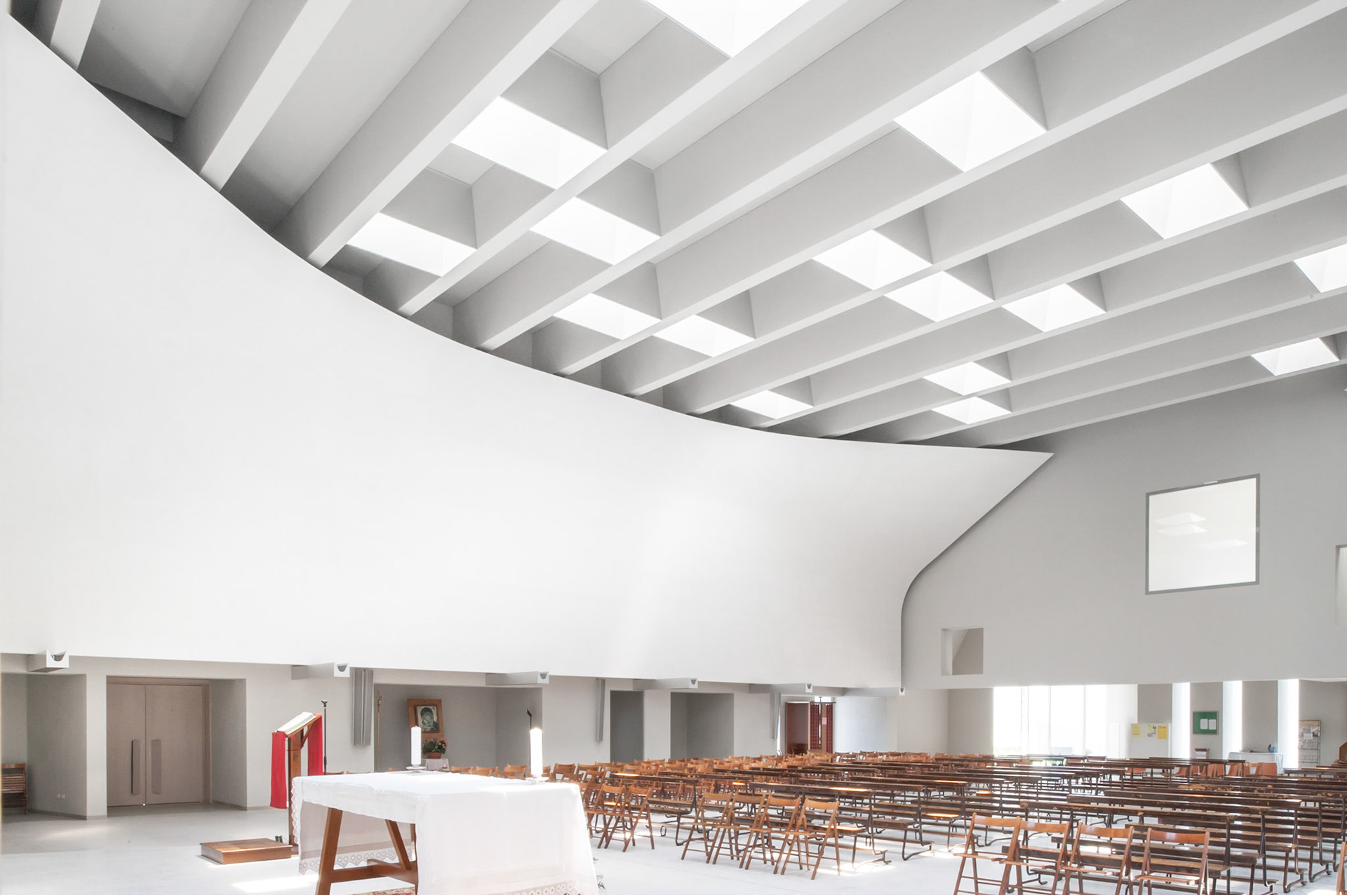
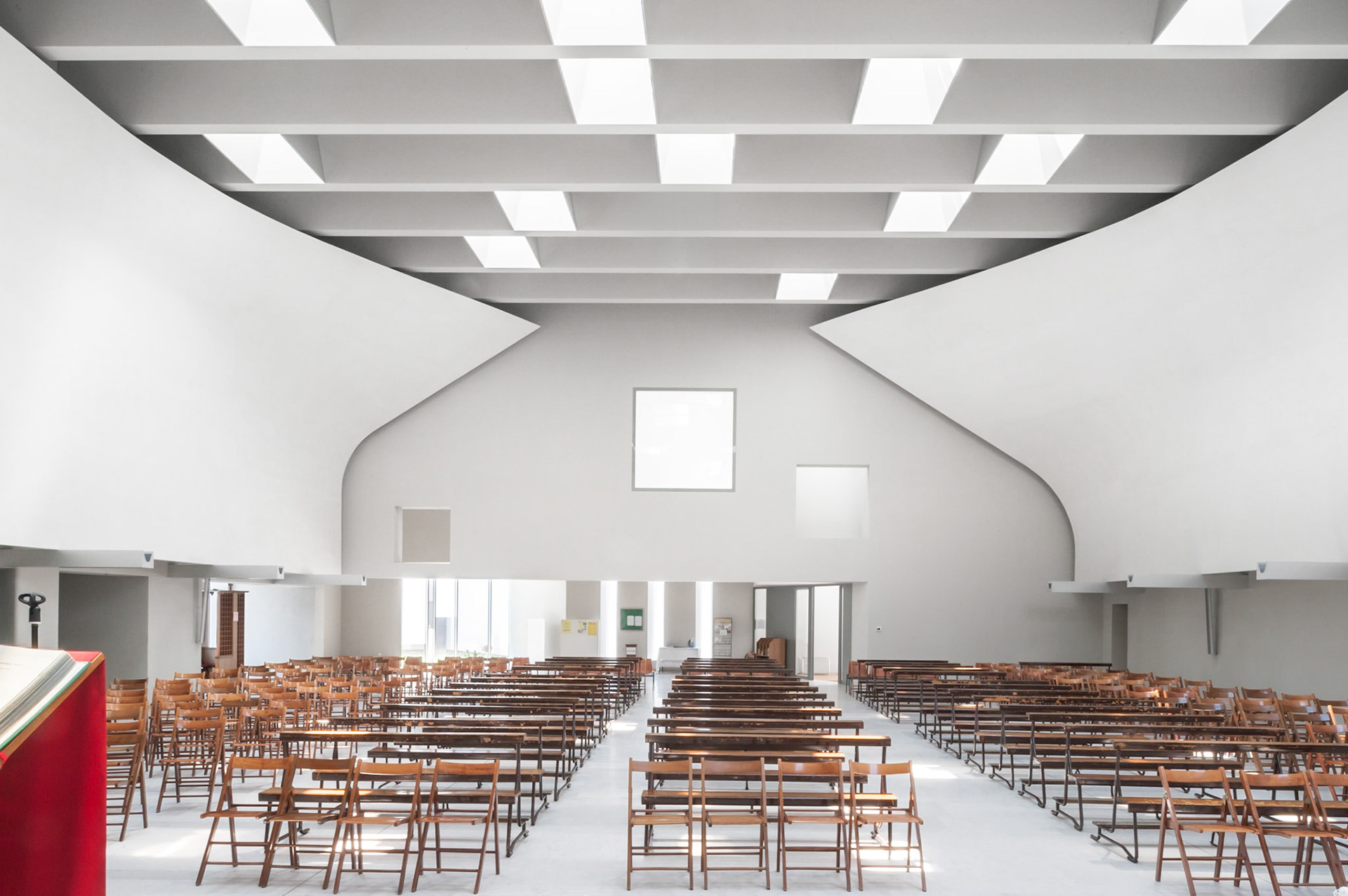
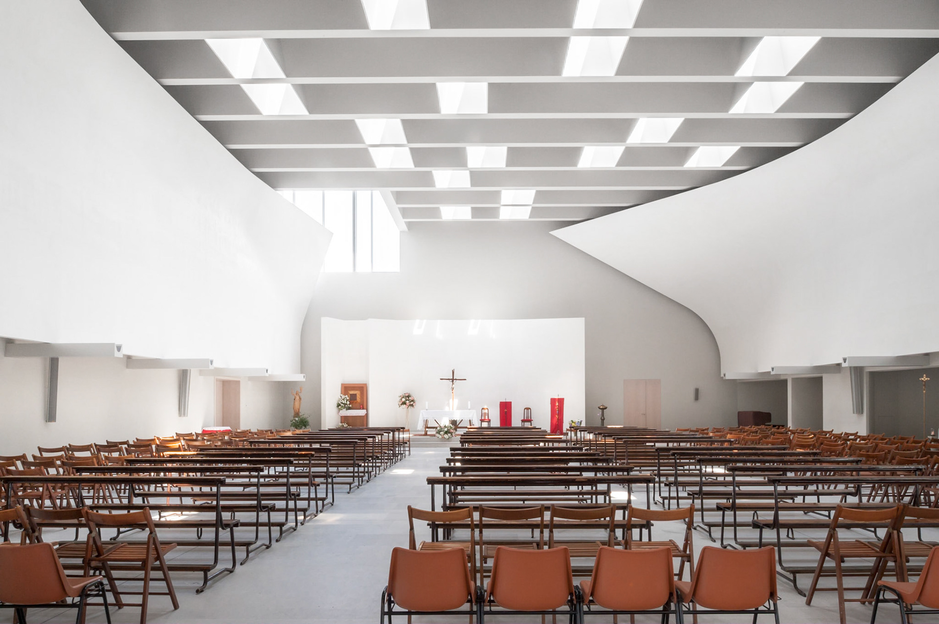
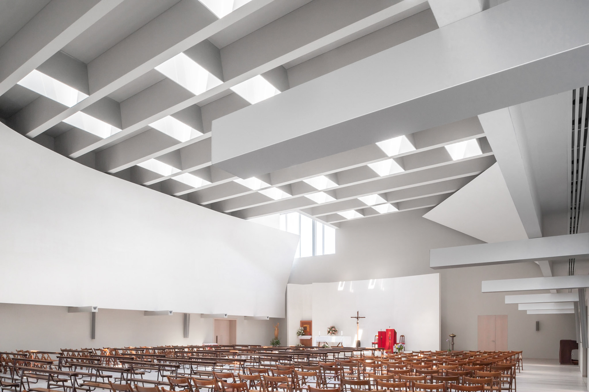
If the general layout of the spaces is entirely traditional, an accurate determination of areas of relevance, the proportions of the rooms, lighting, the simple design of the liturgical space and furnishings express the search for a welcoming space for a contemporary Christian community, where contemplation and activity in the world, daily life and a sense of the sacred are not separate moments, but aspects of a unified feeling. The layout of the new environments which form the parish complex aims to maximise their relationship with its open spaces, opening them up to moments of togetherness which constitute a key element of its life.
The outer facades are faced with an array of vertical slabs of equal dimension but different materials: white Trani stone, Grey Serena stone, oxidized zinc sheets, silkscreened glass. Their rhythm, position and quantity changes according to sun orientation, quality of internal spaces and relationship with the urban setting, generating a bi-dimensional decorative pattern which acts as a finer texture in respect to the bolder volumetric statement. [Text by CZA]
Publications
2010-12 Abitare #508
2012-12 Arketipo #69
2011-02 Elle Decoration Russia #102
2012-11 Area #125 2016-12 LAD #39
Divisare
Dezeen
Hic Arquitectura
Area
Thema
2012-12 Arketipo #69
2011-02 Elle Decoration Russia #102
2012-11 Area #125 2016-12 LAD #39
Divisare
Dezeen
Hic Arquitectura
Area
Thema
